Recession Nugget: 4 Charts for the Equity Bears, 1 Chart for the Bulls!

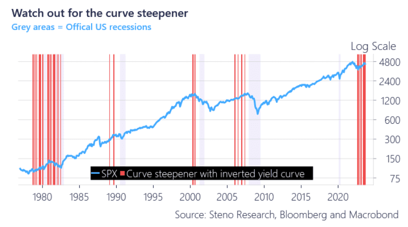
Let’s start by honing in on the historic perspective of the recent moves in the yield curve. Looking at the below chart a steepener from inverted levels, whether bear or bull, has a strong track record of marking a downturn in equities and a recession. Equity longs are already getting a taste of the curve medicine with SPX down some 6% in a month with long-end yields up more than 15%. Judging by the level of the inversion we could be in for even more bumps on the road.
Chart 1: Historically re-steepening of the yield curve means equity pain

We have looked at historical macro data to assess how assets perform around and in a recession, and if we are actually heading towards one.


0 Comments