Introducing ‘The Problem Index’ – Which Countries Have the Worst Demographics?

Welcome to the first article in a series on Demographics. Over the course of this series, we want to give you the most thought-provoking and actionable demographics charts and insights – straight to your inbox.
We will start off by introducing the Problem Index and pointing at some of the most challenging demographics in the world. We would love to hear your feedback and input and thus we have made this article free-to-read. The rest of the series will be part of our Watch Series and require Premium membership – but if you sign up now, you get a 14 day free trial to our Premium Plan and will receive the next installments in the series without paying a dollar for it. Click here read more!
Now – let’s get to it!
Media focus on demography comes and goes on such a whim – an ‘overpopulation’ headline here, a ‘record migration’ report there – that filtering out the signal from the noise becomes unreasonably difficult. In a field so oversaturated with ‘hot takes’, a level-headed approach to demographics between the worlds of academia and standard media is surprisingly absent. Today, introducing our new Demographic Watch series, we hope to go some way to rationalise what demographic trends and forecasts are actually suggesting for the future in an approachable way. We invite you to join us on this journey.
The Trend Isn’t Your Friend
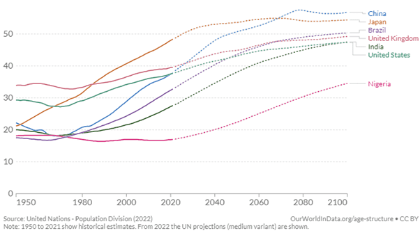
A sensible starting point for our framework begins with the problem of ageing populations. A standard way to think about a maturing population is the median age – literally the age midpoint of a population:
Source: Our World In Data / United Nations – CC Licence https://creativecommons.org/licenses/by/3.0/igo/
In itself – interesting! But this only describes an ageing population, and not the actual problem of an ageing population. The problem rather refers to the growing dependency of an elderly, non-working population, on its younger working cohort. As demographic age profiles of a country worsen, the strain that the growing group of economically consuming, but now non-contributing elderly population places on state finances grows if the size of its working population is unable to ‘keep up’.
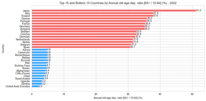
Enter the Old Age Dependency Ratio: the ratio of economically inactive elderly people to the working age population. Calling this a loaded proxy understates things – at what point do we define an elderly population to be inactive, and how do we think about the working age population? Retirement ages clearly differ by country, the proportion of younger age workers differs greatly from place to place, groups of people dip in and out of the workforce even into later lives – the list goes on. Alas, we must abstract at some point, and in our case the sensible approach suggests taking as conservative an estimate as we can (and which the data permits). We therefore consider the economically inactive population beginning at 65, and the working age population between 16 and 64. Filtering for countries with 5 million or more people, what does the current state of the ageing problem look like?
Source: Steno Research
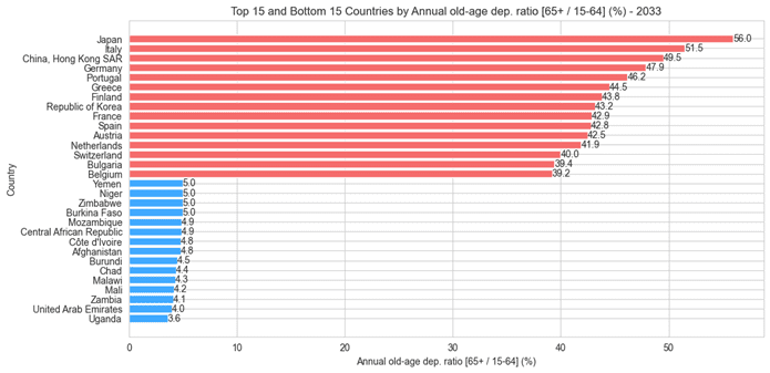
Well, it looks almost exclusively European, with the single exception – and a notable one at that – of Japan. We hear frequently of the ageing problem not only as a future constraint on Japanese society, but one that it is already having to deal with. The Middle East and Africa unsurprisingly scans on the other end of this spectrum, with younger societies shifting the balance. How do things look in 10 years time from now?
Source: Steno Research
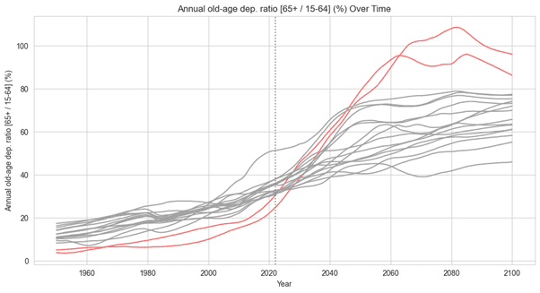
Put simply, the world begins to catch-up. But it is Hong Kong and the Republic of Korea whose meteoric increases in dependency stand out. Korea, staggeringly, moves from 26th place to 8th overall with an increase in its Old Age Dependency Ratio from 24.7% to 43.2%. Shown another way, in grey are the top 15 countries as of 2022. In red are Hong Kong and Korea.
Source: Steno Research
Plugging the Gap
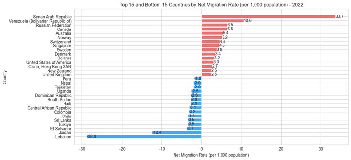
But this is only half of the issue – the question is, what are societies actually doing to deal with the ageing problem? The hiring of migrant labour to plug supply gaps has proven instrumental in managing the issue admittedly early in its evolution. Scanning through the Net Migration Rates of destination countries – i.e. the number of migrants entering a country per 1,000 people of its population – again point to some familiar trends.
Source: Steno Research
We disregard the likes of Syria and Russia due to a volatility factor in the migration series, leaving a top 15 dominated by developed Europe and Asia. A mixture of South American, African and Middle Eastern names make up the bottom 15. This brings two questions to light:
Question 1: We know that Continental Europe and South East / East Asia have a large dependency issue – is this migration effort enough to ‘plug the gap’?
Question 2: Are the largest ‘exporters’ of migrants actually inflicting harm on their own demographic make-up, or is their current lack of dependency enough to mitigate the loss of a working population?
The Problem Index – At a Glance
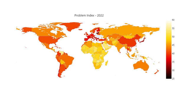
Answers to both require a balancing of the ageing problem against its potential solutions. We therefore introduce the Problem Index: a weighted index of the push and pull between dependency and migration efforts. Essentially, the Index rewards a country with lower dependency and higher net migration inflows, whilst punishing countries with higher dependency and higher net migration outflows. Figures closer to 0 indicate a country failing to deal with its ageing problem. Figures closer to 100 indicate a country managing its demographic age profile well. Using forecasted figures, the Problem Index is also able to assess how countries look set to cope in the coming years.
We can visualise the Problem Index in a number of ways. Regional shifts (a deterioration in Asia, prolonged issues in Europe) even over the coming decade become very clear when mapped geographically. The darker the Index output, the worse the country’s problem:
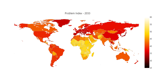
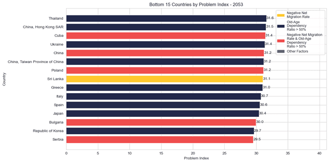
Sifting through for the bottom countries in terms of the Problem Index and applying simple filters highlights the different strain of ageing problem the worst performers are dealing – and going to need to deal – with. Looking, for example, 30 years into the future, the bottom 15 countries paint a picture of divergent paths into their ageing problem. Yellow bars indicate a negative net migration rate (i.e. people leaving the country), dark blue bars indicate a dependency rate above 50% (the point at which there are more people aged 65+ than there are in the 15-64 working population), and red bars indicate both of these criteria being fulfilled – what we refer to as the ageing trap.
Source: Steno Research
Ominously, by 2053, 5 of the bottom 15 countries fall into the ageing trap. And whilst some results – Japan, Italy and China, for example – aren’t necessarily surprising, there are some less obvious results (Poland, Thailand, Korea).
Broadly speaking, we see two camps of countries forming the group of 15 worst performing countries in the problem index: Europe – particularly, Eastern and Southern Europe – and East Asia.
Quick Zoom-In on Two Problem Regions
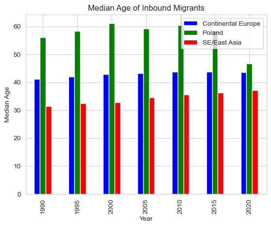
To Understand why Southern and Eastern Europe is falling victim to the ‘ageing trap’ one needs to look at three interlinked issues. Fertility is among the lowest in the world with 1.2 births per woman in Spain and 1.3 in Italy. Fertility in Eastern Europe has also been in rapid decline with an avg. 1.4 births per woman in Poland. Low fertility is a problem across the European continent, but what sets Southern and Eastern Europe apart is the low and even negative – in the case of Serbia, Bulgaria and Poland – net immigration. Emigration rates from Greece tripled between 2009 and 2012, with about half being returning immigrants and the other half Greek citizens—primarily younger, highly educated workers. Italy, Spain, Bulgaria and Serbia are facing similar issues with ‘brain drain’ as youth unemployment remains an endemic problem (15% in Greece and Spain). The rising rate of people leaving the country isn’t adequately offset by incoming immigrants. A right-wing political wave has swept over most, if not all, of the European Countries in the bottom 15. Leaders of the likes of Victor Orbán and Giorgia Meloni have secured the posts on a hardline anti-immigrant platform, which inbound immigration flows have reflected. The few incoming migrants that Poland do receive are almost too old to be included in the work-active group:
Source: Steno Research
In Poland, the median age of the limited migrant population entering its borders is one of the highest in the world, suggesting that immigrants might be native Poles who are re-immigrating back to their home country as they are reaching retirement age. Questions begin to arise about the drain that recent decades of emigration have had, and will have, on its demographic profile in years to come. Poland would need 50 % more working age people than it is predicted to have in 2050 to keep dependency ratios unchanged from 2020, the same goes for Italy and Greece. Spain is predicted to have a 76 % ‘worker gap’ by 2050.
Japan has long been the unfortunate ‘poster child’ of the ageing trap, but more East Asian countries are catching up. Korea has the lowest fertility rate in the world at 0.9 births per woman on average. Hong Kong is at 1.1 births on average as is Singapore. Singapore doesn’t appear in our bottom 15, however, as they have been hugely successful in attracting high-skilled immigrants via lenient talent visa policies. By contrast, Japan and Korea barely receive any immigrants at all. Slowly recognizing their looming demographic crisis, Japan has tried to attract more migrant labour through the implementation of a new visa scheme in 2019. The policy change delivered less than 3 % of the target number of migrants.
To find out what migrant flows mean for the countries at risk of falling into the ageing trap, let’s go back to our two initial questions.
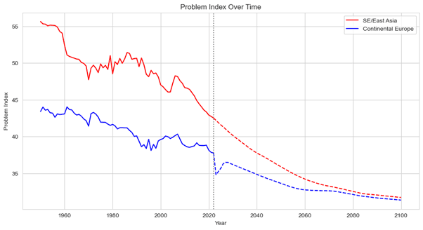
Question 1: We know that Continental Europe and South East / East Asia have a large dependency issue – is this migration effort enough to ‘plug the gap’?
The Problem Index suggests not. Averaging out the index across countries in each region, the trend lower continues in both instances over time – the effects of migratory inflows are not enough to counteract growing dependency. But it does show that the gap between the two regions begins to converge, with the negative index growth rate in Asia coming up against a plateau effect in Europe.
Source: Steno Research
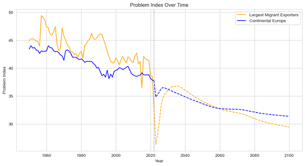
Question 2: Are the largest ‘exporters’ of migrants actually inflicting harm on their own demographic make-up, or is their current lack of dependency enough to mitigate the loss of a working population?
Looking at the average of 2023’s top 10 largest migrant exporters by Net Migration Rate, the Problem Index shows that a current lack of dependency (under 20%) fails to mitigate the huge migratory outflows taking place in said countries. Infact, their demographic profile shapes up worse than Continental Europe.
Source: Steno Research
Scratching the Surface
We hope to have demonstrated the sorts of insights a tool like the Problem Index can unveil. Consider this article a mere taster – a starting point in our demographic journey. Over time we look to build upon the index’s methodology, investigate the questions it poses and transparently share with you our line of thinking. Join us by signing up to stenoresearch.com and please dont hesitate to contact us for any questions or ideas regarding the Demographics Watch!


2 Comments
future seems scary sometimes
Nice.